Amazon listing tips: Amazon’s big 5 pillars of creative and how to use them
In this article, Optimizon’s Head of Creative, Mel Henson, walks us through five Amazon listing tips to help sellers optimise their product listings within the marketplace.
Every single product on Amazon has 5 creative elements to sell the product:
- Title
- Bullet points
- Images
- A+ Content
- Storefronts
All these assets have a role to play. You will find Amazon listing tips for each element below. However, they work best when viewed as a whole to create a seamless customer journey. This is especially important if you have a brand that’s also sold on an eCommerce site and in bricks and mortar stores. It takes a long time to build a brand reputation and it helps to protect it if the emotional experience of shopping for your product on Amazon is the same as shopping elsewhere.
The key to this is understanding the characteristics of the five creative elements and the role each one plays in the customer buying journey funnel.
TITLE – Attracts attention and clearly states what is for sale
Four or five years ago, Amazon listing tips looked very different. The way to get your product to number one was to build a long title, stuffed full of short-tail and long-tail keywords. Even if it didn’t really make sense or went onto six lines, that didn’t matter.
Fortunately, Amazon’s algorithm has gotten a bit smarter since then. They’ve also cut the character limit to just 150 characters for most categories. To see the sort of titles Amazon would like us all to have nowadays you only need to look at their own brand items. The title is extremely brief.
Nevertheless, we think a halfway house is still worth going for, with a clear opening description a couple of relevant, related keywords and ending with a guarantee if possible.
The other thing to pay attention to is taxonomy. What’s that, I hear you ask. It’s about always building your titles in the same order. Amazon guidelines mean that you must start with your brand name, then the product title. After that consider what information, you need to put in. For some products, like collectable sets of saucepans or lawnmowers, the product code is essential to help people be sure they’ve got the right one. Some products need dimensions. Set a style and stick to it. This helps the consumer to compare products and gives a consistent appearance which helps build trust in your brand.
BULLETS – Communicates the benefits and inspires interest
You used to be able to have seven bullets of up to 500 characters. Now it’s five of 255 characters for most categories.
We recommend building a framework. Bullet 1 should be an overview, so that anyone who only reads bullet 1 will get all the key information. Bullets 2 3 and 4 should be about the product. Sometimes you may have something common to all, for example if all the products are in recycled bottles with FSC cartons. If so, it’s fine to use the same bullet point 4 for every product.
The fifth bullet point can expand on the guarantee or the company.
We also recommend writing in the third person as if Amazon were speaking about your products, this contrasts with the A+ which is very much in the first person.
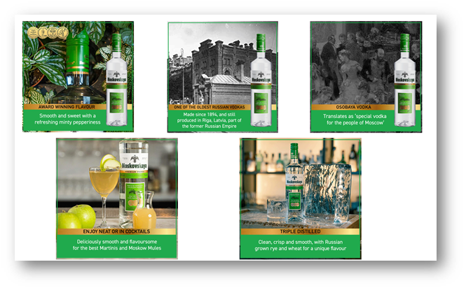
IMAGES – The visual equivalent of the bullets
A few years ago, it was good enough to just pop a few images up but now the smart money takes a curated approach. At Optimizon we refer to this as ‘storyboarding’ the images.
On mobile, many people don’t even look at the bullets – they just see the images. It’s the perfect opportunity to create a coherent brand experience for your shoppers by adding Instagram-style captions to them, in graphics that reflect the brand.
However, it’s not enough to simply bung on a few words. As much thought needs to go into it as the bullet’s listings. Once the bullets framework has been worked out, the same story should be told on the images.
We have seen this approach add as much as 53% to sales – but only when it’s done properly!
A+ CONTENT – Expanding on the brand, closing the sale and cross-selling
Remember the days when Amazon A+ was called ‘Enhanced Brand Content’? Back in 2016 when it was introduced it was a brand-new feature, initially by invitation only.
Now it’s a key feature available to all. Amazon say that A+ increases sales by up to 10%.
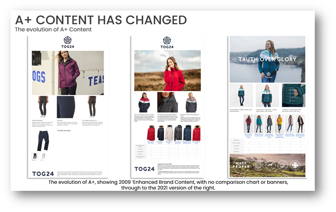
The trend a few years ago was to plonk a logo at the top, followed by a banner. Then in July 2019 biggest revolution was introduced, the Comparison Chart. This allows you to drop in up to 6 ASINS which are clickable through to the product. Showing attributes in the table below really help show off the main features. Not only is the Comparison Chart fantastic for cross-selling and upselling it’s also brilliant for search to help you get your products ranked higher on Amazon.
Below shows the evolution of A+ for one of our clients, TOG24. On the left is the old style, with no comparison chart, our first tentative forays, and today, with minimal text to enhance the mobile experience.
There is also Premium A+ a paid-for service, which offers a few more bells and whistles. A word of caution – don’t use them just because they’re there. If they don’t help you tell your brand story, don’t be tempted to use them, just because you can!
One word of warning on both A+ and Premium A+ – Amazon has a lot of words that you can use in bullets but not on A+. These include anything to do with certifications or guarantees. For more information, can check out our blog on all things A+ Content here.
STOREFRONTS – Credibility and a complete consumer shopping experience
This relatively recent feature, introduced to the UK in September 2018, is the final piece of the total creative representation of your brand on Amazon.
Each year we are seeing more and more engagement and an increase in visitor numbers to storefronts. They also really help amplify the effects of an ad campaign when used as landing pages.
Even with the restrictions of Amazon’s modules, it’s possible to replicate the look and feel of your own website. They should also be updated as regularly as your own website to mirror the same themes.
So that’s our round up of the Amazon listing tips within Amazon’s 5 creative pillars. It takes time and effort to do it properly, but the results are always worth it. Not only do you enjoy a higher level of sales and more organic traffic, but there is also the qualitative benefit of giving the consumer the best experience wherever they shop for your product – vital to protecting your brand’s long-term reputation with your customers.
If you require help with your creative assets on Amazon, then our creative team can help you. Just get in touch today here!